It’s burdensome to create product pages for every product you have, especially if you’re an online store with more than 10.
For this reason, merchants use Shopify product page templates to provide an easy and time-efficient way to create dedicated product pages for multiple products at once.
What are Shopify Product Page Templates?

Shopify product page templates are preset page layouts that are applied to one or more products in your catalog.
They eliminate the need to create product pages for every Shopify product in your online store.
As a result, when you add a new Shopify product, you won’t have to create a new product page for it. The newly added product would already be provided one via the Shopify product page template.
Depending on how your product page templates are set up, they may not only help you scale product page creation but also improve engagement and conversions for your Shopify store as well.
Do You Need a Shopify Product Page Template?

Yes, these are necessary, especially if adding more products to your store will become standard operating procedure. Notice how the template shown above is assigned to 10 Shopify products.
Shopify provides all online stores on their platform with product page templates. However, the default setting may not be the best for you.
For this reason, you may need to find a theme with the ideal product page templates you’re looking for.
You may also need to tweak the theme’s product template to achieve your ideal store layout.
How to Create Shopify Product Page Templates
Here are a few quick steps to creating your ideal Shopify product page template.
Step#1: Find a Theme With a Good Product Page Template
Each theme has its own page templates—a blog page template, a password page template, and a product page template, to name a few.
Your starting product page template, as well as how much you can further customize the said template, will depend on your chosen Shopify theme.
To do that, first, go to the Shopify theme store.
Shopify themes can be classified into two types—paid and free.
Free themes won’t cost you anything, and hence is the more attractive option. But note that compared to paid themes, they have quite standard customizability and relatively more bland product page templates.
Paid themes, on the other hand, offer more features and customization, giving your product page templates an advantage over the competition.

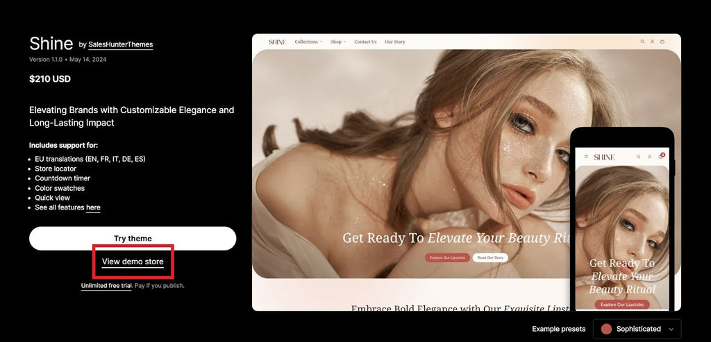
In this example, we use Shine - the best converting theme
Choose any theme you fancy and click on “View Demo Store.”
This will allow you to experience the said theme by navigating through its store—one that’s built entirely by the theme you’re assessing.
Through this demo store, you can see how the product pages are set up, giving you a proper description of what that theme’s product page templates are like.

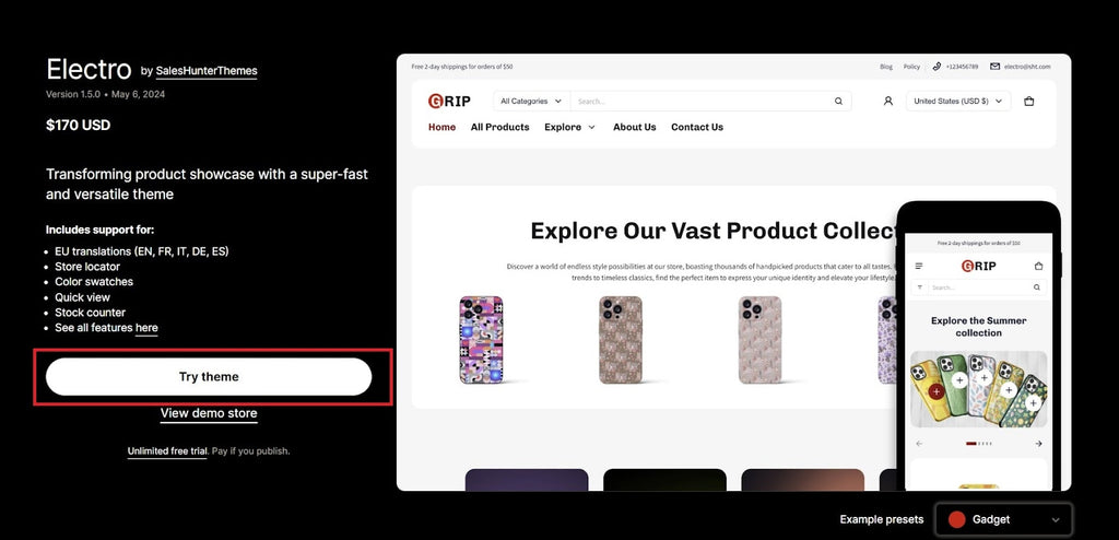
In the case of paid themes, you may select “Try Theme” to explore it via the Shopify theme editor. This will give you a more hands-on feel for the theme.
After you click “Try Theme,” Shopify will download the trial theme to your theme library.

From there, click “Customize” to launch the Shopify theme editor and explore the theme.
Step#2: Customize Shopify Product Pages in Shopify’s Theme Editor
Once you’ve chosen a theme, go to Shopify’s theme editor to edit it.
Here, you can edit the Shopify product page layout.

First, click on the page navigation drop-down. This is labeled with “Home page” at the top of the editor.
Click on Products.

You have two options—click on “+ Create template” to make a new Shopify product page template, or click on “Default product” to edit the existing theme's default product page template.
For this example, we’ll select Default product.

This will take you to the default product page template, allowing you to edit it.
Note that any changes you make to this template will affect all the product pages that use it. So, make sure the edits you make aren’t particular to any one product. Unless only one product uses that template, that is.
Editing the product template can be an article of its own. Also, how the product page is customized depends highly on the theme you’re using.
So, be sure to explore your options in the Shopify theme editor.
Add sections and blocks to your product page template to make them stand out from the competition. Include your brand assets as well to make the product pages cohesive with the rest of the website.
Step#3: Add some Apps for Added Functionality
Take your product pages further by using apps to enhance the page experience.
Some recommended apps that can help improve conversions include:

Customer testimonials. Testimonial apps allow merchants to display customer feedback on the respective product page. They serve as social proof of the product's effectiveness.

Source: Easy Tabs
Product tabs. These tabs organize detailed product descriptions into organized tabs that visitors can click on, making all the details more digestible.

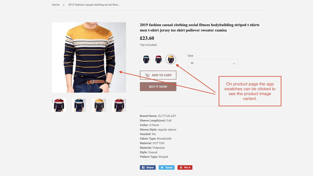
Source: Swatcher
Product swatches. These swatches display the different product variants available on your product page. They’re typically for showcasing various clothing color options.
Go to the Shopify app store and install the apps you need. The apps you’ll use for your ecommerce website depend highly on the products you sell.
For example, if you sell digitally downloadable music, you can add an audio preview to your product page templates. Doing so will be helpful to any potential customer.
Once you’re satisfied with the layout and features of your product page template, apply the template to your products.
Product recommendations
Add some product recommendations on Shopify can boost your revenue through upsell and crossell, sell 3 on just 1 product page is easy.
Step#4: Assign The Templates to Products
If you’ve edited the “default product” template, all products in your Shopify store will automatically be updated with the newly created template.
That’s assuming the default Shopify product setup, where all products are assigned the “default product” template.
But if you created a new product page template, you’ll need to assign this new template to your products.

To do that, go to the Products section from the Shopify admin panel.
Click on the product(s) whose product page template(s) you want to change.

Go to the theme template section then set the template to the new one you’ve created.
Great! You’ve updated your Shopify product page template.
Tips for Creating High-Converting Product Page Templates
Now that you know how to create product page templates, we’ll tackle some crucial tips for creating high-converting ones.
Use High-Converting Themes
Not all themes are created equal.
Some themes have more converting features than others. Some have better customizability and design. But do note, though, that these will fetch a higher price than the more standard themes.
Using high-converting themes will give your product pages more features and personality, as opposed to using just free themes.
Take Shine, for example.

Shine lets merchants add countdown timers to their banners, inciting FOMO and conversions.

Shine also has a carousel customer reviews section that can assure site visitors that they’ll be getting a quality product.
It’s features like these that give product pages more personality and customer engagement than free themes.
When implemented properly, high-converting themes not only improve your bottom line but also better your brand engagement and affinity.
Follow Best Design Practices

Best Shopify store design practices help your product page maintain a desirable, non-overwhelming appearance, resulting in a better page experience.
It would make for a lengthy article to go through an entire Web Design 101 course. So we’ll just list the basics:
- Keep your product page’s colors and typography in line with your brand identity.
- Add high-quality product images with proper product image size and videos to your Shopify product listing. This will give potential customers a better idea of your product.
- Make your buttons stand out by making them a contrasting color from their background. This may improve your CTA’s click-through rate. Buttons are also key elements to a page's layout, so giving them a splash of color can make the page pop more.
- Avoid chunks of paragraphs. Bullet point and break down bigger paragraphs into smaller paragraphs. This should make your product details more readable.
- Use headers on the more important text. This makes the site skimmable while also providing visual balance to the copy.
There are many more web design rules to know about and follow. But abiding by these tips mentioned above can do plenty for your product page.
Keep Things Simple and Straightforward
Remember, less is more.
It may be tempting to cram all your product’s features and brand’s awards on the product page. But remember, the shorter a message is, the more impactful and memorable.
Also, keep your apps and features to a minimum. Adding too many third-party apps can slow the site and negatively affect the page experience.
Examples of Ideal Shopify Product Pages
With all the tips in this guide taken into account, here are some examples of well-crafted and high-converting product pages.
MattressStop

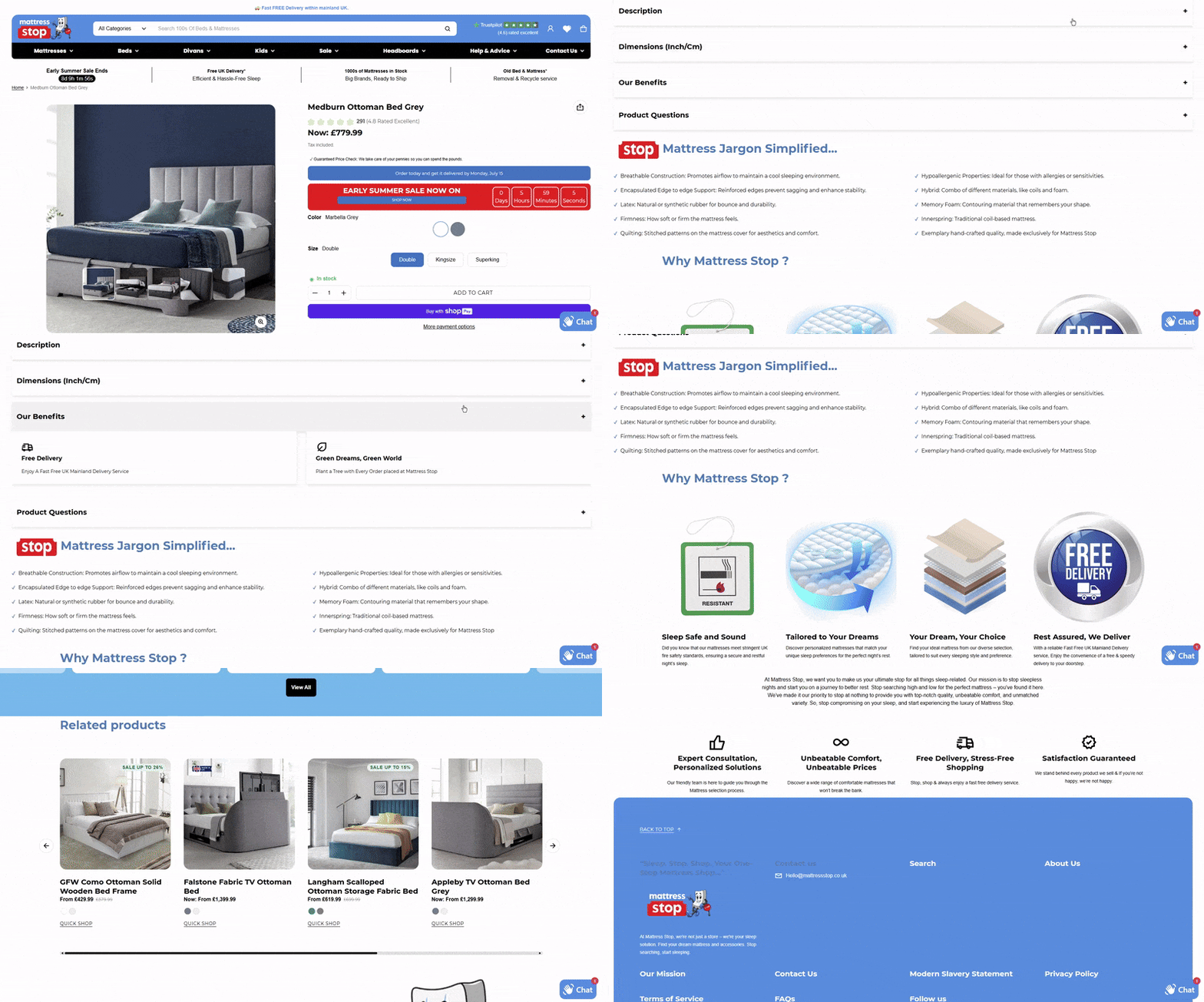
MattressStop’s product page abides by the brand’s colors.
The crucial buttons, such as the “Buy with ShopPay” button, stand out from the white background.
Scrolling further through the page, visitors can see that the product description is neatly tucked into their respective collapsible tabs.
MattressStop also highlights its products’ key features with imagery
Towards the bottom of the page, MattressStop displays the product’s respective testimonials, giving site visitors some confidence in the item.
Blendjet

Blendjet is a masterclass in product page creation.
Its product page manages to be loud and on-brand without overwhelming site visitors.
At the top of the product page, Blendjet shows off its promo discount, which can nudge site visitors to make a purchase.
There are also color swatches that display different style variations for the blender.
Plus, the product page upsells potential customers to purchase multiple products as a bundle.
Scrolling down the page, visitors are greeted with engaging product imagery—including a slideshow and product videos for the key features (e.g., USB-C rechargeable, self-cleaning, collectable colors).
Blendjet then places testimonials after these features, leveraging social proof.
Shine Demo Store

The Shine demo store may not be a real store, but its product page is a great example following engaging and converting best practices.
This store upsells site visitors on other accessories they can use with the viewed product.
There’s also marquee text scrolling across the screen, helping highlight some product features.
As visitors scroll, they can learn more about the product through the info tabs. Each tab displays a feature about the product, as well as an accompanying image.
There’s also a text hotspot section wherein users may mouse over the “hotspots” of an image, allowing them to learn more about the product.
Users will also see testimonials and a product image gallery as they scroll.
At the end, there’s a CTA that asks visitors to join a club to get 15% off. This is an excellent way of converting leads, especially if they haven’t made that purchase yet.
Find the best theme to start building your product pages: Shopify 2.0 themes
Conclusion
Ecommerce businesses can better engage their target audience with a potent product web page. This, in turn, will result in better conversions.
Plus, the tips in this guide aren't limited to just Shopify stores. Any ecommerce website can improve its website content with this guide.
It's also crucial to use high-quality images and learn product photography. You won't fully benefit from the product page template tips in this guide unless you utilize stellar photos for your product page.


